
CATEGORYInternal Site
ROLEProduct Designer
CLIENTYEARMorgan Stanley
2025
Financial institution MUFG partially merged with Morgan Stanley, creating a need: a customer-facing event sign-up portal. The goal was to build a simple, self-service option quickly to replace Morgan Stanley’s white‑glove process, where employees booked and canceled registrations for clients. That old workflow used several applications and was cumbersome even for experienced staff, so the new project focused on consolidating processes, simplifying the user journey, and launching an intuitive portal fast.
Our user base was located in Japan, which made research more challenging due to time zone differences and cultural nuances, but I arranged several requirement‑gathering sessions with key internal stakeholders to map their current workflows on both the MUFG and MS sides; additionally, I benchmarked existing conference and corporate event sites to identify best practices and opportunities for streamlining the end‑to‑end experience.
Discovery
Initial Exploration
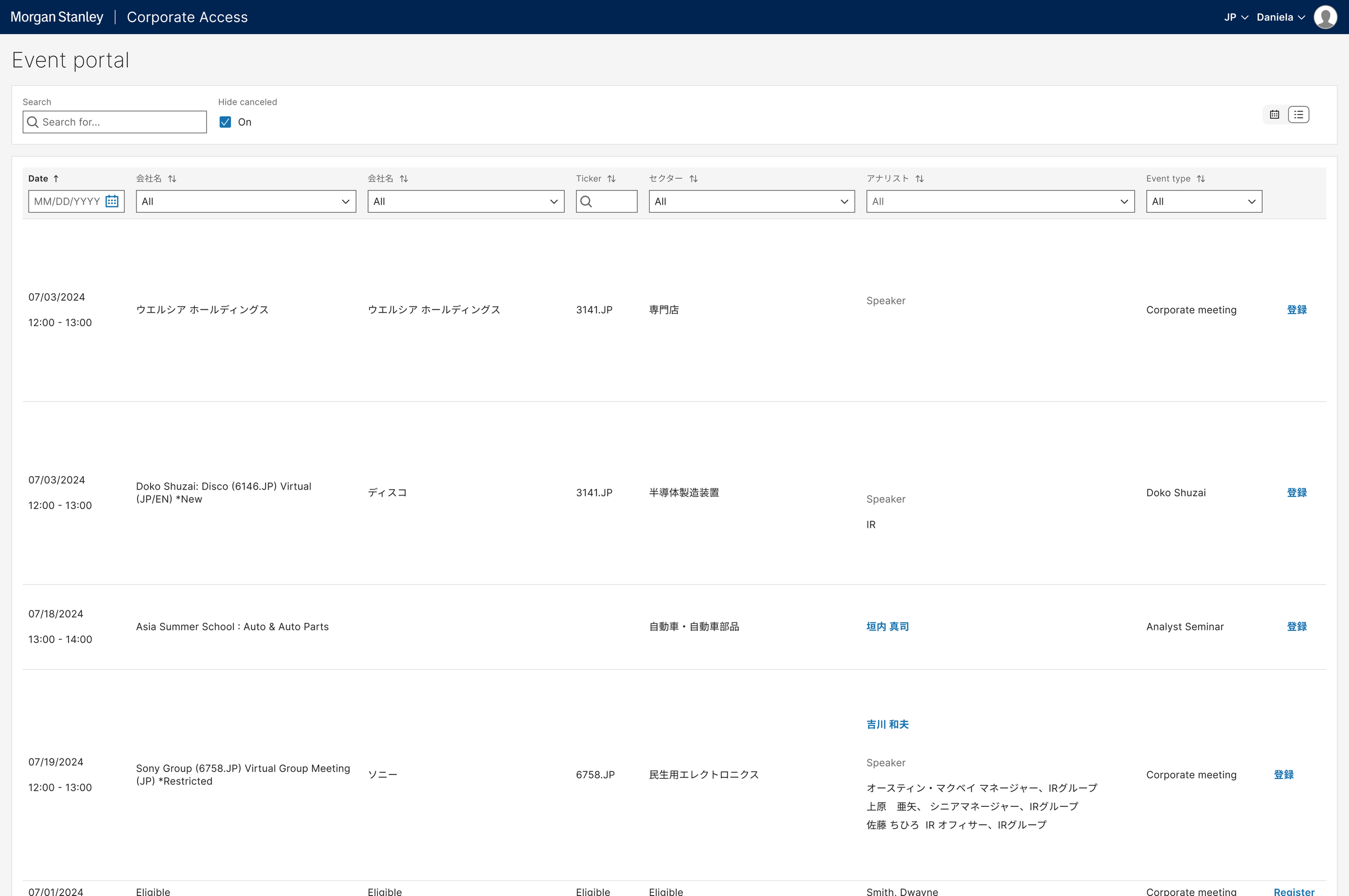
With speed in mind my earliest design began very basic, a simple table or grid view that would be quick for the technical team to deliver on a short deadline.
After rounds of feedback, we felt this approach wasn’t user-facing enough and wanted a more public consumer-friendly interface.
Moving forward
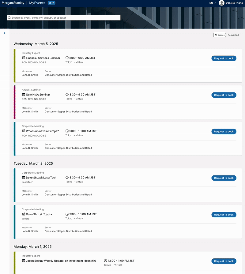
To support a more client‑facing approach and shift away from a calendar view, I redesigned the layout into a clean list view that uses increased negative space for clarity and color‑coding to distinguish event types. This simplifies scanning, highlights priority items, and improves readability across devices while keeping visual hierarchy consistent.
The number of filters required warranted a side panel, since the horizontal layout read too much like a spreadsheet.
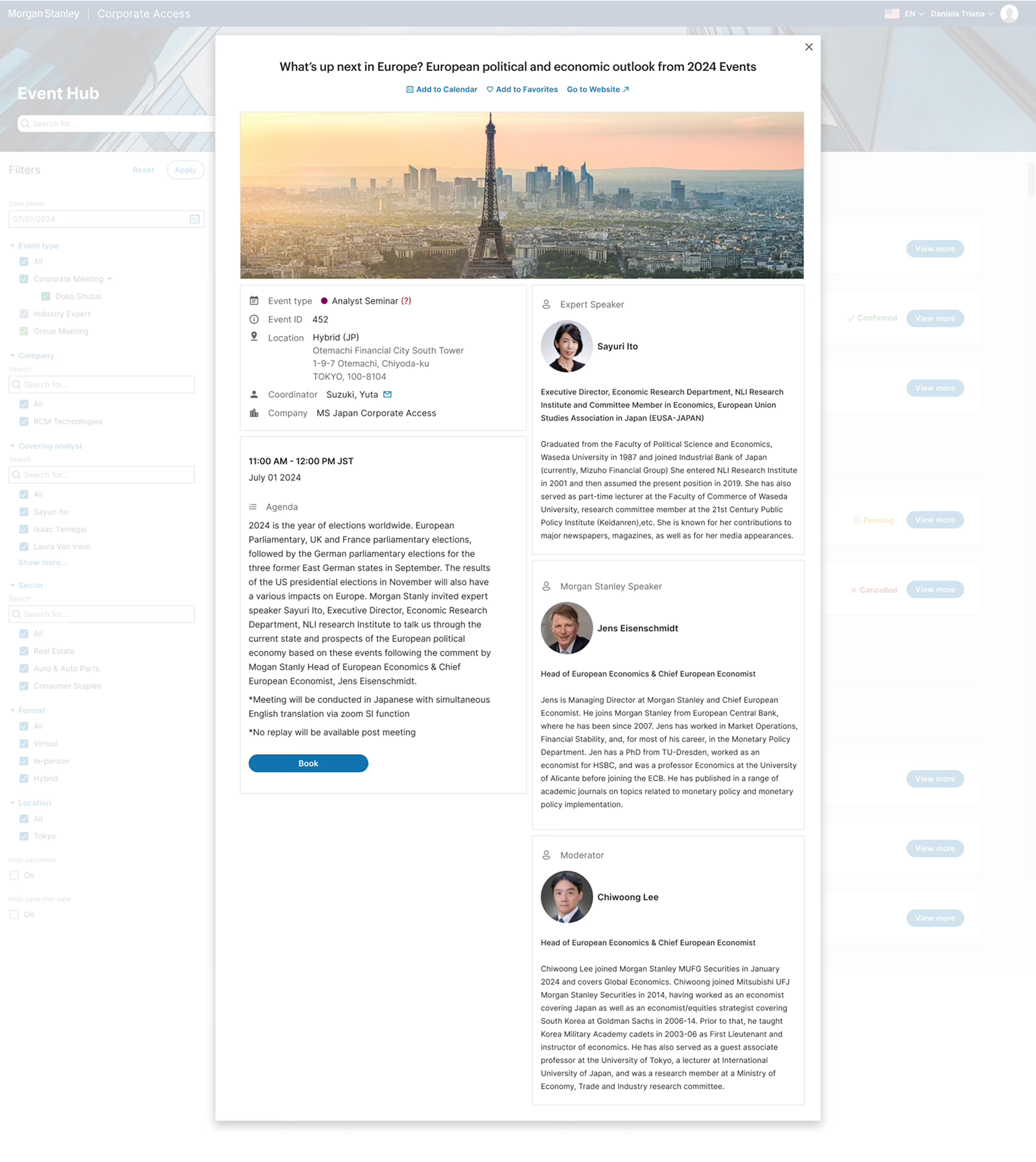
I initially created end-to-end flows for self registration with full dialogs of event details, but ultimately we had to pare down to only a manual request sent to the account manager to officially register for Day One due to technical limitations. Despite that constraint, clients retained the ability to browse and select events, cancel if needed, and receive important notifications tied to their chosen events.
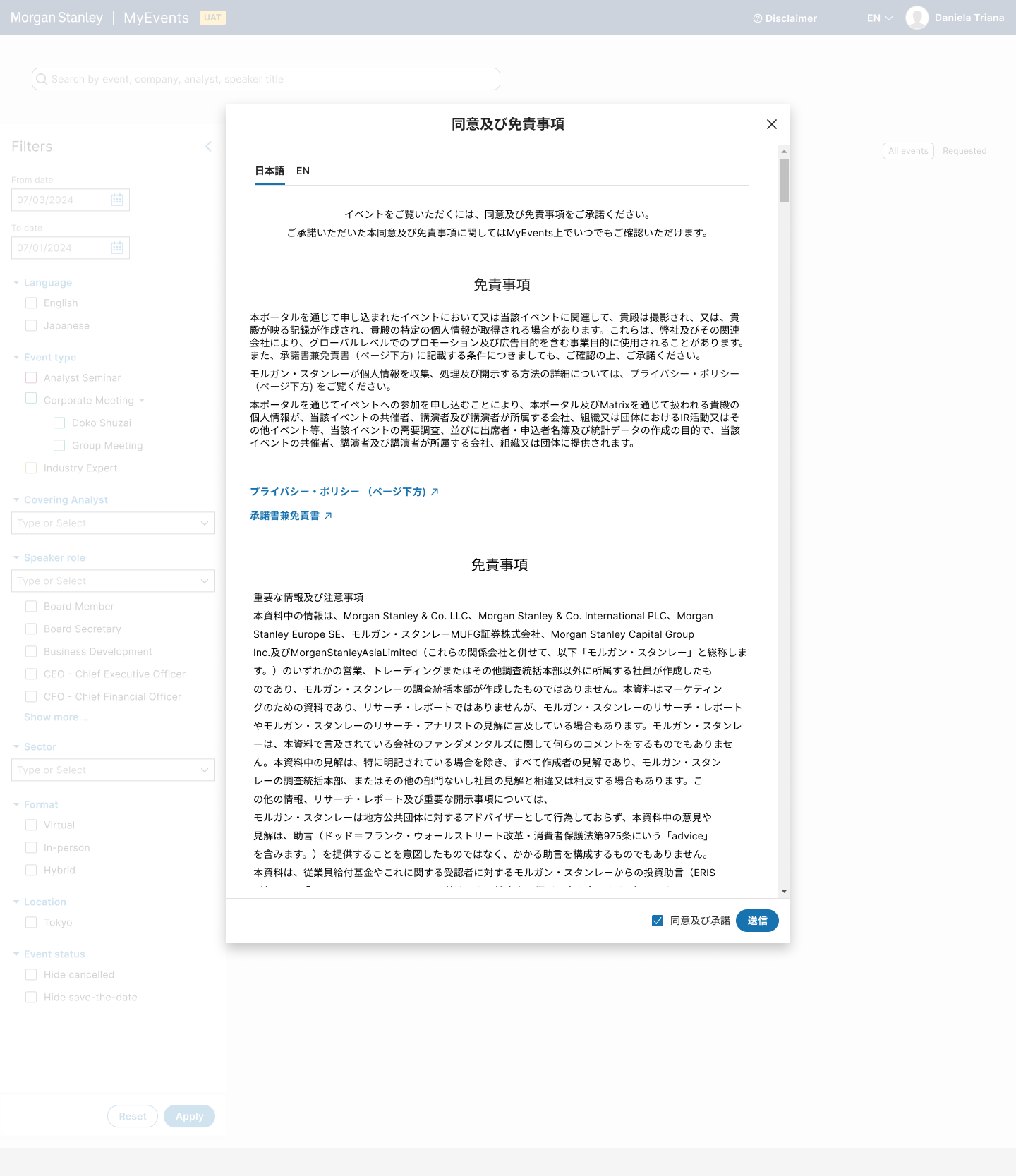
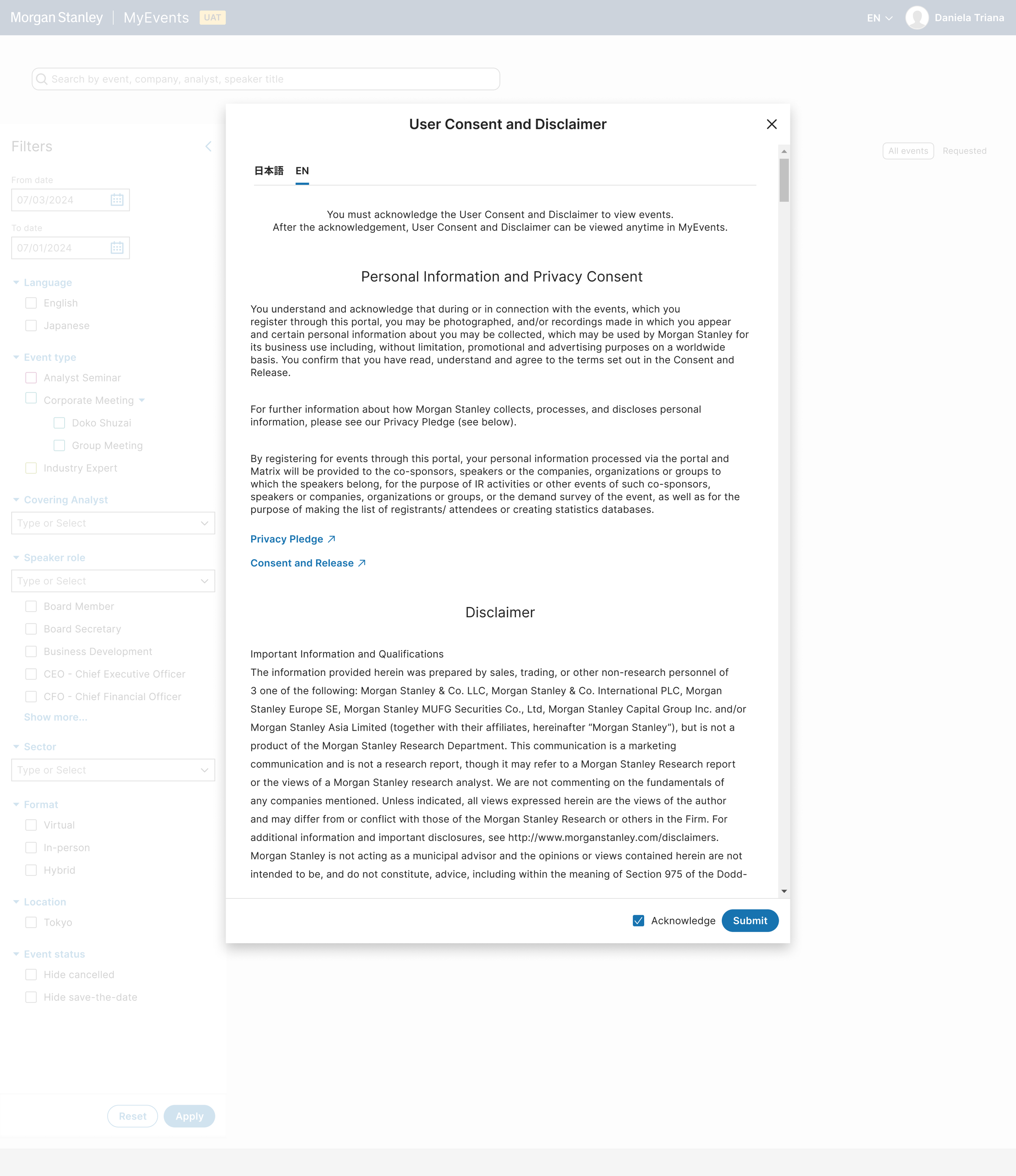
Disclaimer Dialog
Before launch, it was required to display a clear disclaimer outlining how user data would be collected, stored, and used, and summarizing key terms and conditions. I collaborated closely with project management, key stakeholders, and with compliance to ensure legal and regulatory requirements were met, translation was correct, and presented a seamless experience for users. The final disclaimer balanced transparency for users with practical implementation needs, and was integrated into the product flow ahead of release.
DAY ONE
Beta Launch
User acceptance testing allowed us to finalize many technical details, including the filter mechanism, the hierarchy and layout of the tiles, and the accuracy of translations.
We launched a practical, user-approved solution built for scale. It met customer needs from day one and was engineered so capacity and features can grow without rework.

