CATEGORYMedical Software
ROLEDesign Intern
CLIENTYEAR3M
2020
The Kingdom of Saudi Arabia (KSA) issued Vision 2030, a “bold yet achievable blueprint” for their nation with healthcare being one of the main sectors they are transforming.
With the shift to electronic medical records and improved data accuracy, they asked 3M to create a web-based data abstracting and reporting solution for public hospitals in the KSA.
Starting point
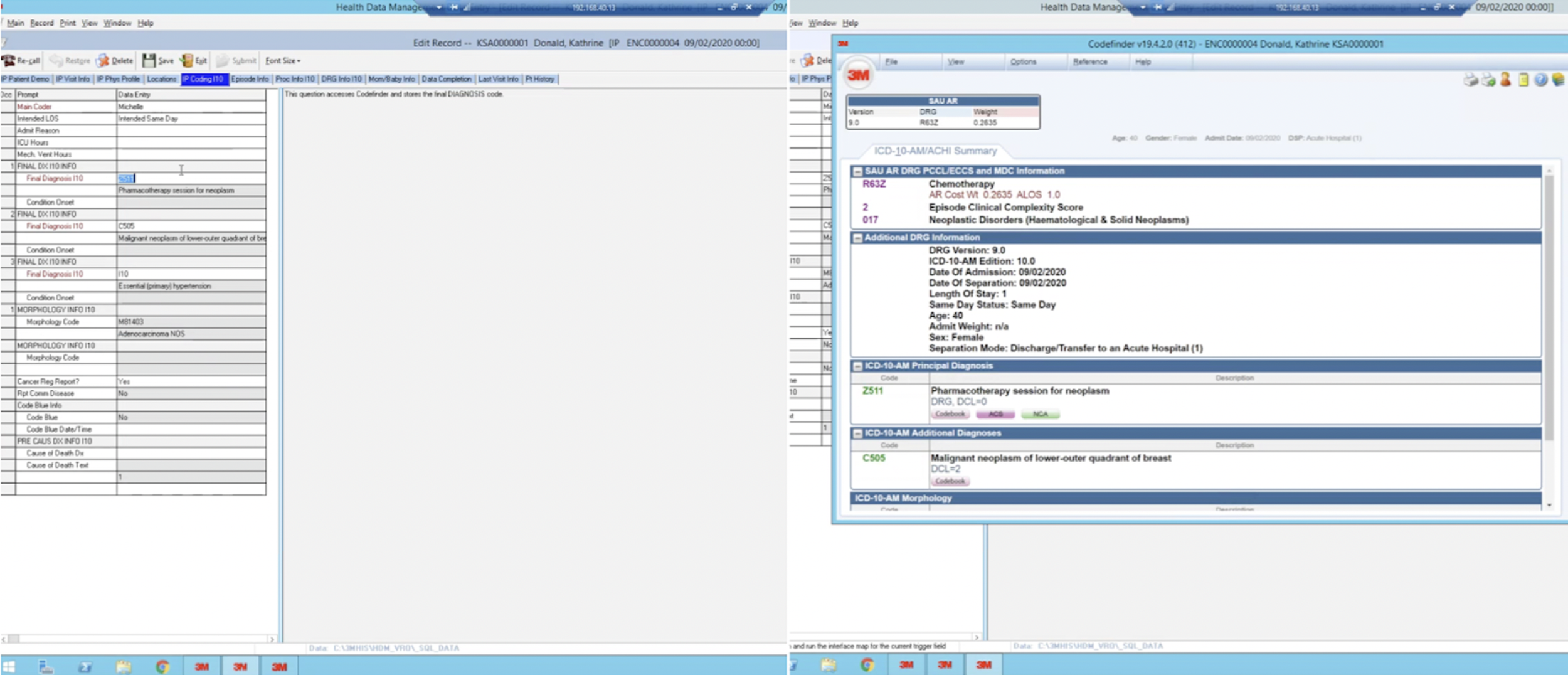
The initial business decision was to use HDM, an existing 3M software, as a starting point in order to save time. This photo shows a glimpse of what the current software looked like. It was outdated, but still well-liked and used in the hospital industry. Instead of HDM, it was colloquially just referred to as “3M” by medical coders.
Discovery
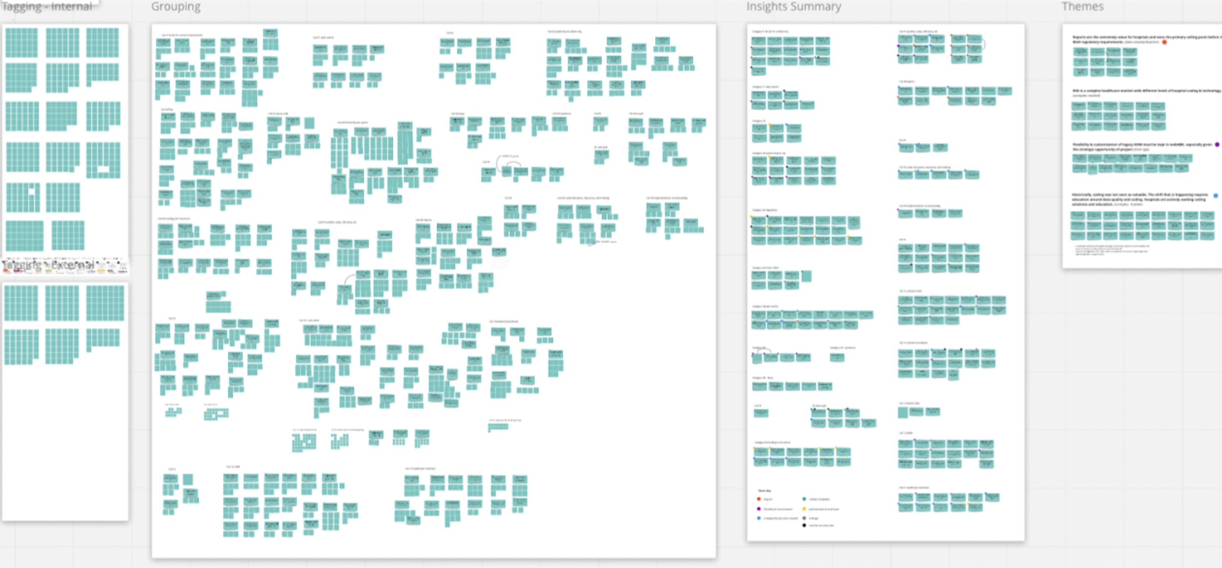
My manager, a UX researcher, and I conducted interviews with users both in the U.S. and overseas to understand current workflows and pain points. In total we completed 23 research sessions, yielding 956 data points and roughly 200 insight groupings.
Some key quotes from participants:
“I’ve always used 3M my entire coding career” - Coder with 34 years experience, US Hospital
”HDM helps a lot with reporting, especially if the department is requesting something specific i.e., what is the top procedure for the department etc” - Coder, KSA private hospital
”There are many steps involved…some I wish we could eliminate” - Coding manager, KSA private hospital
”I’d rather have my coders put out accurate data the first time, rather than have to go back and correct it” - Coding manager, US Hospital
Initial exploration
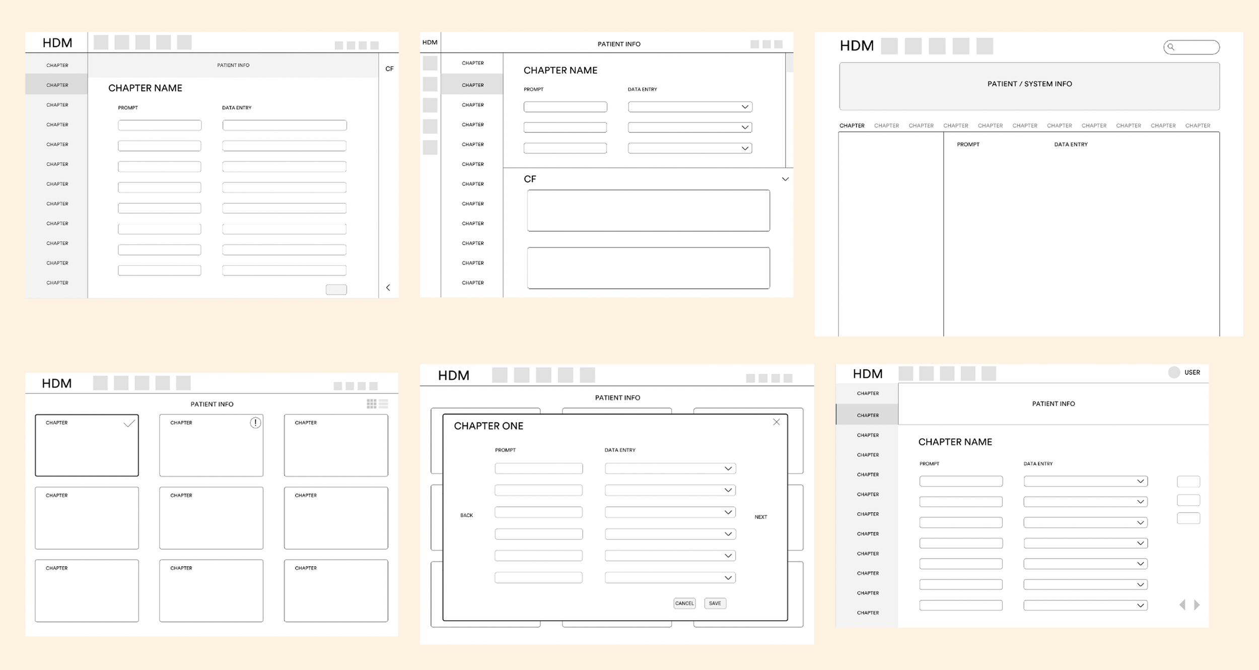
I began the design process with a visual audit and flow analysis to map every screen and clarify requirements. With that foundation I prioritized screens by key interactions paths, and defined component needs.
Then I began with simple layout variations to determine which configuration would maximize speed and accuracy for medical coders while keeping all the essential data immediately visible.
Usability testing
Moving forward with the left‑menu layout, we conducted usability testing with the same participants from our earlier research, now using an interactive prototype.
This allowed us to align new workflows with customer needs, expectations, and mental models and provide insights to the development team for the MVP.
Key findings showed that efficiency was users’ top need, and many relied heavily on the keyboard, so we implemented keyboard shortcuts. Users responded positively to the progress indicators and the consistent information presented across the top, with only minor adjustments made to the text.

MVP launch
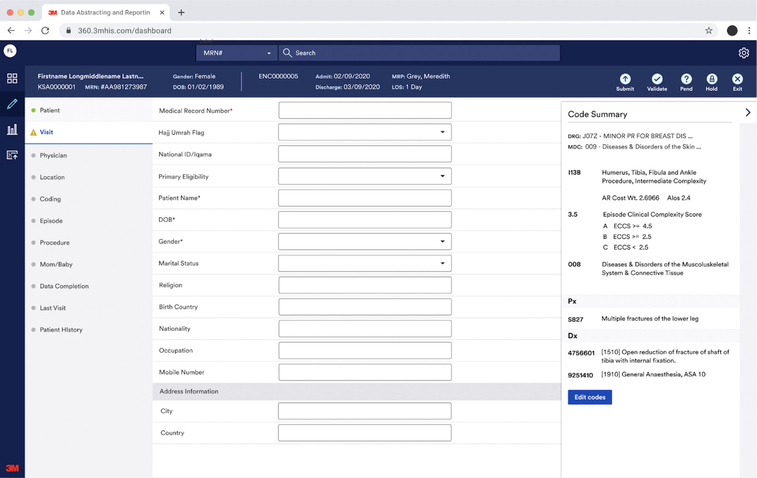
We successfully launched the MVP to users on a twelve-week timeline. It met user needs and served as a scalable starting point, with the expectation that it would continue to evolve.
Side note: I’m grateful to have had this experience as an intern to witness the entire development process and see it come to life!