
Morgan Stanley Events
A self-service registration portal for corporate events hosted by Morgan Stanley.
Team
2 designers, 3 PMs
Duration
6 months
Client
Morgan Stanley
Year
2025

Project Brief
Japanese financial institution MUFG partially merged with Morgan Stanley in 2024. This project was result of the business need for a corporate event sign-up portal, something they were already used to having. The goal was to create an easy-to-use self service option that could be delivered quickly.
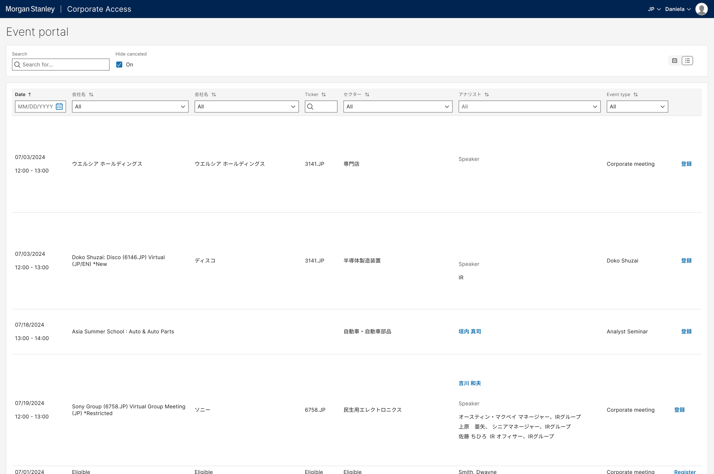
The solution Morgan Stanley currently offered was white-glove service, meaning it required an employee to book and cancel event registration for the client, and stretched across multiple applications resulting in a clunky experience even for a seasoned employee.
Discovery
Our user base was based in Japan which made research challenging. I was able to set up a few requirement gathering sessions with key internal stakeholders to understand their current flow, both on the MUFG and MS side, and benchmarked existing conference and corporate event sites.
Initial Exploration
With speed in mind my earliest design began very basic, with a table or grid view that would be quick for the technical team to deliver on a short deadline.
After a few rounds of feedback with the team, we decided this approach felt too server-side and wanted to create a more consumer friendly interface. In later iterations I added more white space and color coded the events. I had also put together a custom calendar view, but was not in the design system at the time so due to the time constraint this was shelved for later.

Iterations
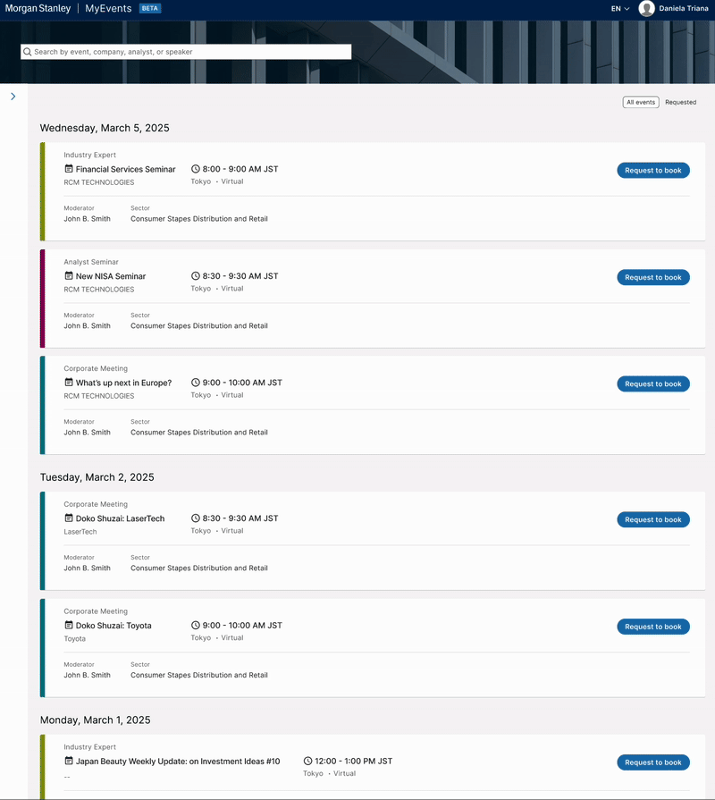
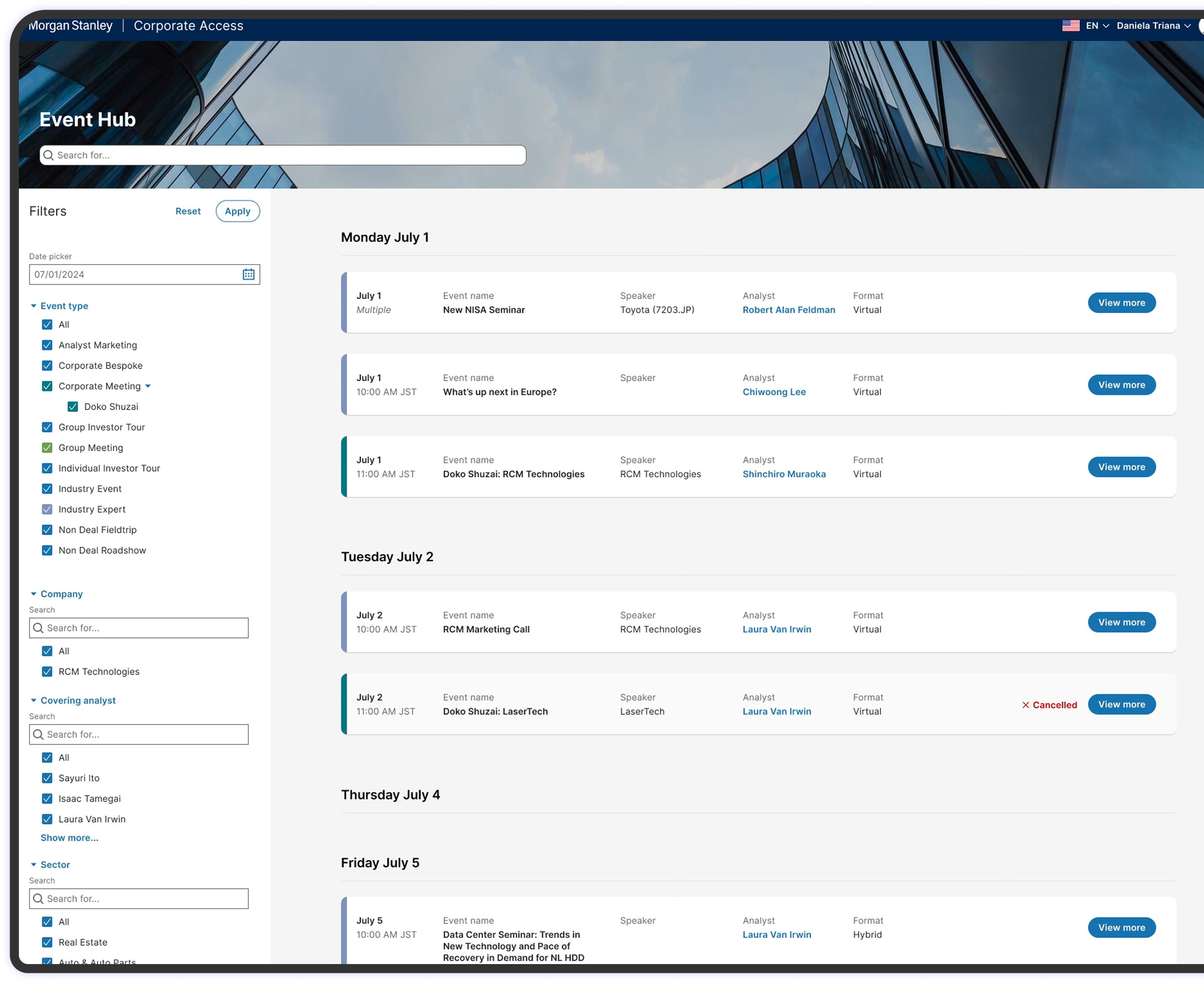
As we moved forward with a more client facing approach while veering away from a calendar view, I changed the layout to a list view with more negative space and color coded based on the event type.
The amount of filters required called for a side panel, and the horizontal design felt too much like excel.
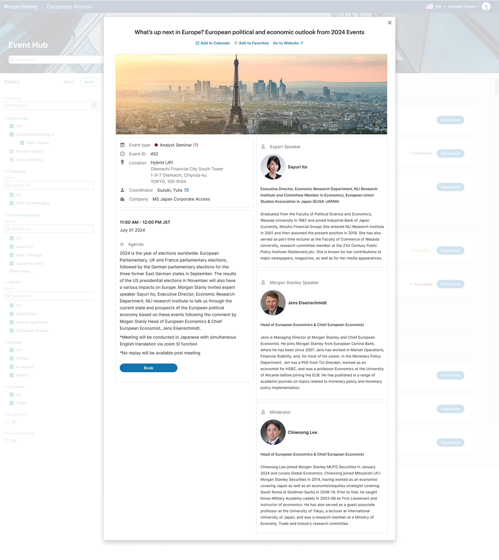
I created end-to-end flows for self registration, but ultimately we had to pare down to only a request sent to the account manager to officially register for Day One, but this at least provided an option for clients to browse and select which events they wished to attend, and also to cancel and receive important notifications based on the events they chose.

DAY ONE
Beta Launch
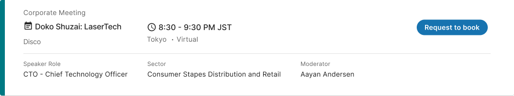
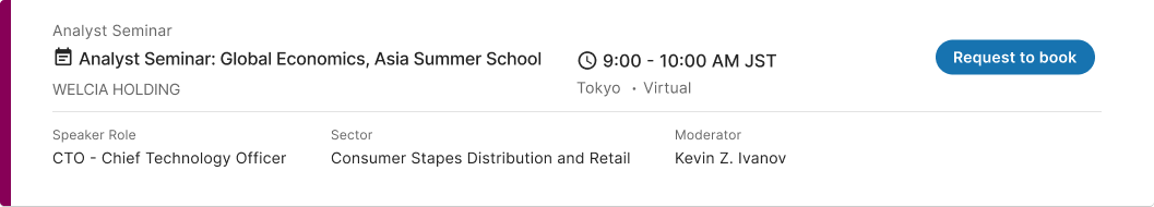
The tiles with the event information on them went through many reviews, since we were limited to what we could show on the page since the scope was parred down. It was important to achieve a clear hierarchy of information with everything one would need to know at a glance.


Final Design
User acceptance testing allowed us to settle on many of the technical details, such as the mechanism of the filter (e.g. are all selected at the start or none), the layout of the tiles, and any bugs along the way. Although the beta release was not up to full functionality as one might expect the audience was super relieved to have a viable solution ready in such a short amount of tine.