
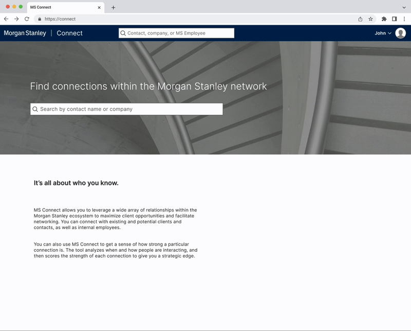
Morgan Stanley Connect
An internal networking site to leverage current and alumni employee connections to spark new ones.
Team
1 designer, 1 PM
Duration
3 months
Client
Morgan Stanley
Year
2024
Project Brief
MS Connect was an already existing site within the Morgan Stanley ecosystem, having been around for over 10 years.
To align with the ‘One Firm’ movement, upgrading all sites and channels to the new look and feel, the brief was a visual refresh.

Before beginning the redesign, I conducted multiple rounds of internal interviews with 8 current users of the site to understand their flow and pain points. Some of the key takeaways were current data integrity issues with the site, users desiring more context about the connections (how they know them, how well, etc), however overall they felt that the site was useful with a great deal of potential for smarter integrations as well.
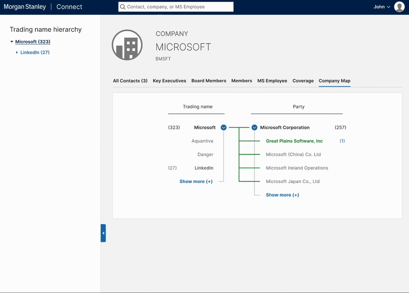
FEATURE ONECompany Map
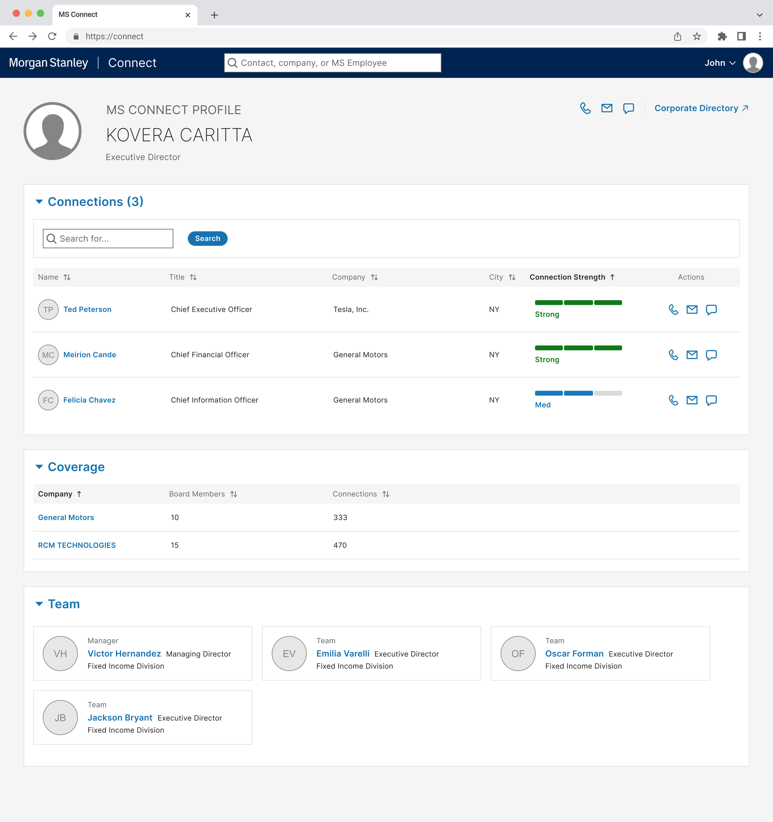
During discovery I found that the tool was used beyond its original use as a so-called internal linkedin, it’s often used as a reference to quickly and easily see how their client’s company is structured for example. The previous version of the site did include a company map, but I made some visual upgrades and added the side panel. In this first iteration shown here, we have tabs across the top for the sections.
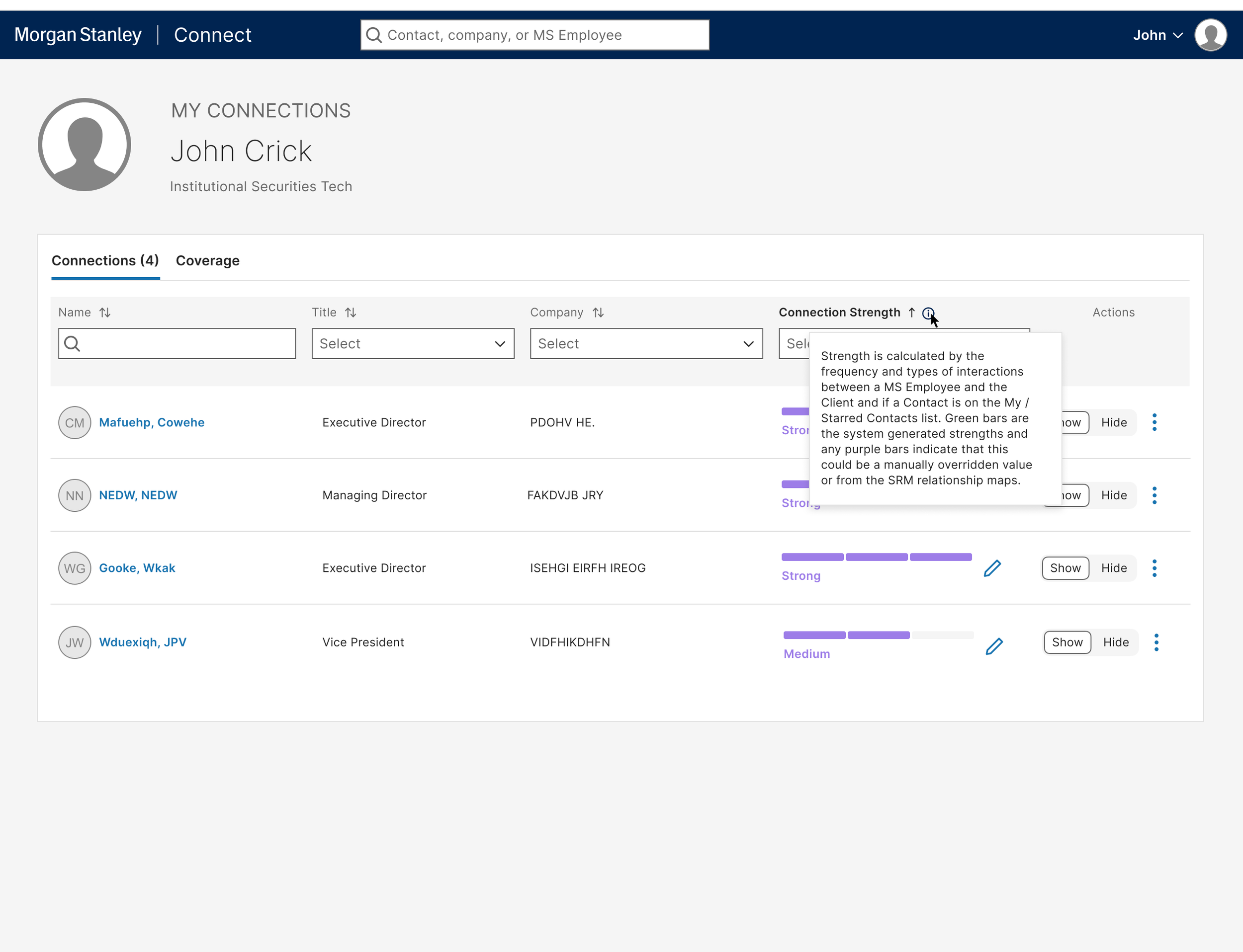
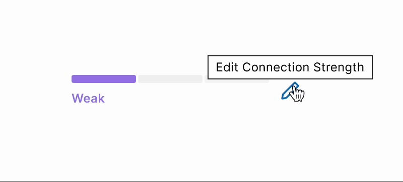
FEATURE TWOConnection Strength
There are both system generated and manually added / overridden connections. I worked with compliance to add help text providing more information on how the level is determined. I also improved the interaction of manually editing connection strength within My Connections.
FEATURE THREETeam
Context was one of the most common requests while gathering requirements. Users want to make sure they are reaching out to the optimal person. I added a team section so they could be sure they were not making duplicative efforts, reaching out to members of the same team. As mentioned before the tool is often used beyond it’s intended purpose, and this gives a glimpse of an org chart.
We ultimately decided on the separate container layout over the tab format because of the holistic view it provided.